Tech Policy
This is what filter bubbles actually look like
Maps of Twitter activity show how political polarization manifests online and why divides are so hard to bridge.
American public life has become increasingly ideologically segregated as newspapers have given way to screens. But societies have experienced extremism and fragmentation without the assistance of Silicon Valley for centuries. And the polarization in the US began long ago, with the rise of 24-hour cable news. So just how responsible is the internet for today’s divisions? And are they really as bad as they seem?
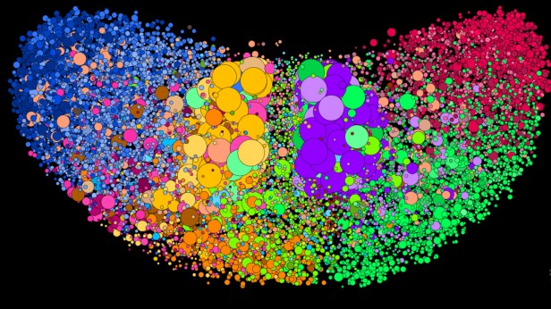
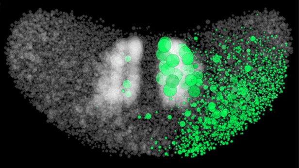
In this Twitter map (below, and in 3-D form above) of the US political landscape, accounts that follow one another are clustered together, and they are color-coded by the kinds of content they commonly share. At first glance, it might seem reassuring: although there are clear echo chambers, there is also an intertwined network of elected officials, the press, and political and policy professionals. There are extremes, but they are mediated through a robust middle.
However, as the following diagrams will show, the middle is a lot weaker than it looks, and this makes public discourse vulnerable both to extremists at home and to manipulation by outside actors such as Russia.
A press divided
If social media were merely a distraction from an otherwise normal diet of professional news, its impact on democracy would be limited. But this map (directly below) from scholars at Harvard’s Berkman Klein Center and MIT’s Media Lab, based on “co-citations” (i.e., who links to whom), shows that the media world is bifurcated too.
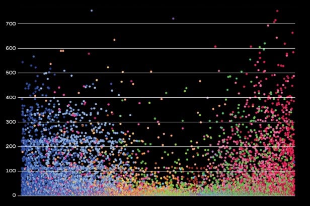
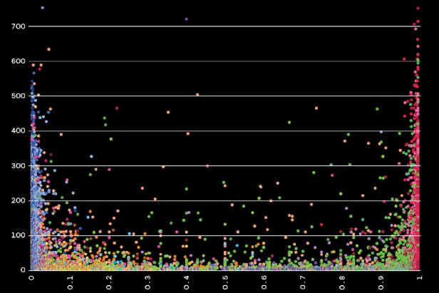
(right) If we analyze the same data by looking at citations of individual articles rather than news sources, the divide is even more stark. The articles that get the most tweets represent the most partisan views on both left and right.
How Russian trolls exploit division
The polarization seen in the diagrams above is fertile ground for misinformation operations such as the one Russia conducted to influence the 2016 US election.
Instead of trying to force their messages into the mainstream, these adversaries target polarized communities and “embed” fake accounts within them. The false personas engage with real people in those communities to build credibility. Once their influence has been established, they can introduce new viewpoints and amplify divisive and inflammatory narratives that are already circulating. It’s the digital equivalent of moving to an isolated and tight-knit community, using its own language quirks and catering to its obsessions, running for mayor, and then using that position to influence national politics.
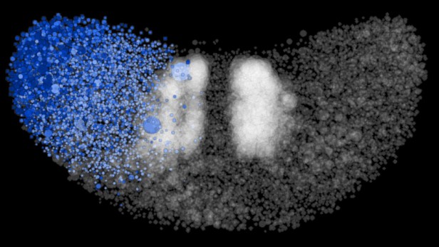
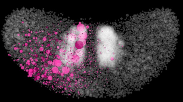
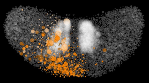
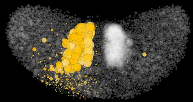
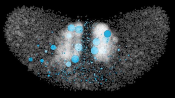
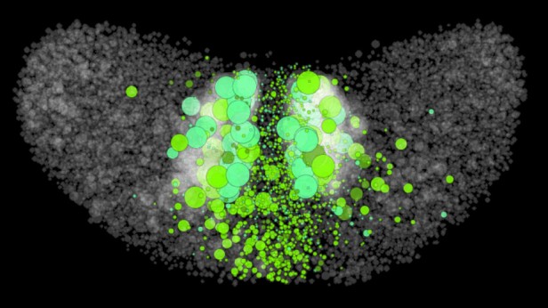
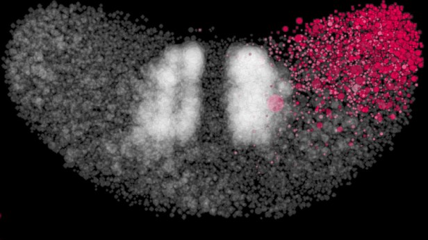
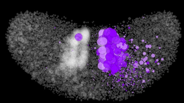
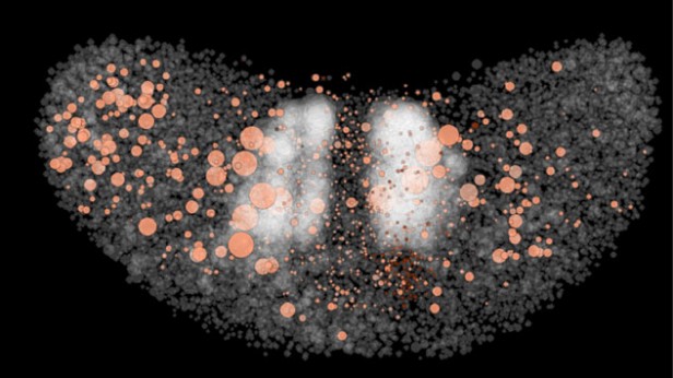
The first of the two maps in the GIF image below shows the US political spectrum on the eve of the 2016 election. The second map highlights the followers of a 30-something American woman called Jenna Abrams, a following gained with her viral tweets about slavery, segregation, Donald Trump, and Kim Kardashian. Her far-right views endeared her to conservatives, and her entertaining shock tactics won her attention from several mainstream media outlets and got her into public spats with prominent people on Twitter, including a former US ambassador to Russia. Her following in the right-wing Twittersphere enabled her to influence the broader political conversation. In reality, she was one of many fake personas created by the infamous St. Petersburg troll farm known as the Internet Research Agency.
The Iranian blogosphere
The echo-chamber effect on the internet is nothing new. This 2008 map depicts the blogosphere in Iran, clustering together blogs that link to each other and coloring them by their content. Before a sustained government crackdown on online speech, supporters (lower right) and detractors (lower left) of the clerical regime each enjoyed substantial followings.
Turkish Twitter
This Twitter map of the political landscape in Turkey, analogous to the US map at the beginning of this story, shows multidimensional polarization, with a dense sphere of influence around Erdogan supporters, on the far right side of the map, and two different poles of opposition on the other. These “amplification cores” of highly connected accounts have a disproportionate influence on the conversation and can rapidly boost polarizing messages.
Russia: The same but different
This Twitter map of the Russian political landscape shows polarization in another context. There are clear pro- and anti-Putin clusters, but they’re knit together by a broad set of mainly pro-government news and discussion-oriented accounts. A halo of apparently automated “personal” and marketing accounts surround the Putin fans.
John Kelly is CEO and Camille François is research director of Graphika, a social network analytics company.
