
Intelligent Machines
Windows 8: Design over Usability
Windows 8 gets a lot right, but Microsoft’s determination to offer computer and mobile users the same interface makes the operating system somewhat weird.
Windows 8 is a computer science masterpiece trapped inside a user interface kerfuffle. Microsoft’s new operating system for phones, tablets, laptops, desktops, and servers brims with innovative technologies, bold ideas, and visual elegance. The system’s radical new interface, called Modern, is a pleasure to use on phones and tablets. And although that interface fares poorly on today’s larger desktop computer screens, Windows 8 probably won’t damage the company’s standing in corporate America. It might even shore up its eroding presence on residential desktops and laptops by offering a user experience that’s new, fun, and different from anything offered by Apple and Google. Indeed, that’s my only real criticism of Windows 8: the touch-based user interface is clearly designed for consuming information and having fun, rather than for doing serious work.
It makes technical sense for Microsoft to maintain a single, core operating system with a consistent set of application programming interfaces (APIs). In fact, it makes so much sense that Apple and Linux moved to a single kernel years ago. What’s different about Windows 8 is that it gives users a similar graphical user interface (GUI) on every platform, too. Microsoft has spent more than a decade trying to get cut-down versions of its operating system, with names like Windows CE, Pocket PC, and Windows Mobile, accepted on mobile platforms. Some of these systems even had scaled-down versions of the standard Windows desktop interface—complete with pop-up windows, buttons, scroll bars, and even tiny Start buttons. But their GUIs and APIs were just different enough to confuse programmers and users alike. Windows 8 finally delivers consistent GUIs and APIs across the Microsoft ecosystem, although it is now the desktop that wears the tablet’s clothes.
It’s easy to find things that are wrong with Modern (which was called Metro in developer and early versions). For example, there are no overlapping windows, and there’s simply no way to put three or four applications on a single screen at the same time—even if your work space has a screen that’s 27 inches across. Windows 8 largely eliminates menus—the product of more than 40 years of usability research—and introduces a new system of touch-based text labels and controls that are frequently hidden and obscure. The interface is sparse—applications like e-mail and the address book now present far too little information on the screen, resulting in the need to frequently pan and scroll.
Complicating our understanding of whether these are bugs or features is the departure of Steve Sinofsky shortly after the product’s launch. Sinofsky, who had been president of Microsoft’s Windows Division and was seen as a likely successor to Microsoft chief executive Steve Ballmer, was the very public face of the redesign. He spent more than a year documenting many of the more radical departures in his blog, Building Windows 8, with detailed posts that were supported with telemetry data captured from the millions of users who participated in the Windows Customer Experience Improvement Program. Microsoft will never admit that Windows 8 is a colossal mistake, but was Sinofsky’s sudden departure an admission of sorts that some of the changes were just too radical? Will they be undone in some soon-to-be-released Windows 8.5?
While many critics have decried Windows 8 as another Microsoft misstep, I think they’re wrong. After using the new operating system in all its incarnations on a phone, on Microsoft’s Surface tablet, and on several desktops, I’ve come to regard it as truly transformative. Windows 8 will well serve the needs of those nontechnical users who just want to access their online social networks, watch Netflix, and go shopping—especially since the underlying system provides more security while making it easier for them to find, download, and install their (Microsoft-approved) apps. Windows 8 does a poor job of catering to knowledge workers like me who earn a living by synthesizing information from multiple data sources or use application programs that have hundreds of specialized features. But those brain-heavy office workers do not represent Microsoft’s present or future.
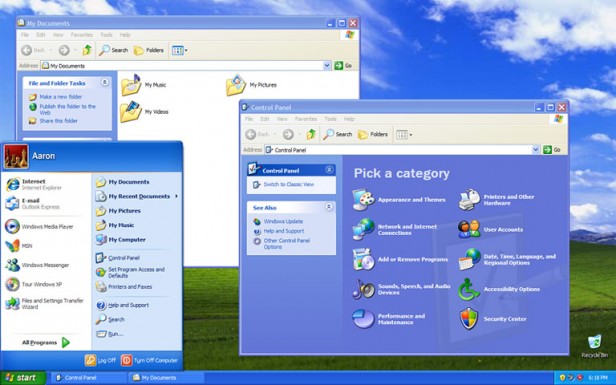
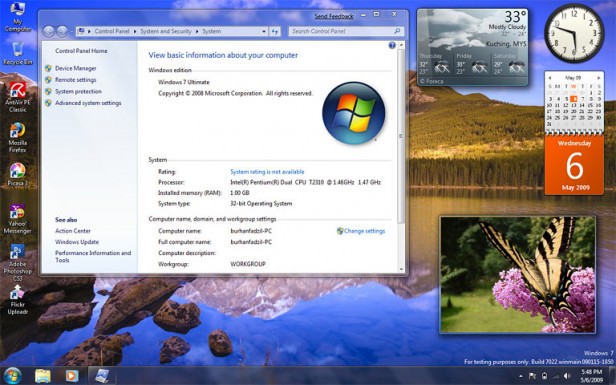
Last year, Microsoft made just $18 billion (24 percent) of its $74 billion in revenue from the sale of Windows operating systems. Its real moneymakers in the corporate world are not operating systems for desktops but applications like Office and servers like Exchange. Many of Microsoft’s corporate and government users are only now upgrading from Windows XP to Windows 7. Few corporate IT departments will immediately deploy Windows 8 to their desktops: they can continue to support older versions of the operating systems for years, or until Microsoft releases a version of the new operating system that’s appropriate for offices. Windows 8 doesn’t need to be an efficient, productive business-oriented operating system to be a success; it needs to win the home market by making laptops and desktops as much fun to use as phones and tablets.
Fast, Connected, and Secure
The idea of a single operating system to be deployed on all computing platforms—from the slowest of cell phones to relatively high-performance laptops and desktops, and even supercomputers—has clear technical benefits for users. Consider power efficiency: new algorithms and data structures inside the core of an operating system can let the kernel perform more functions while executing fewer instructions. Such changes extend the battery life when the OS is run on a cell phone. On a server in a data center, those same changes will lower electricity and cooling bills.
Developers also benefit from having a single OS. For example, it means that the same tools can be used to develop applications for all platforms, so advances can be made immediately available across the entire product line. A single OS with the same set of APIs also means that a programmer with experience working on, say, cell phones can be rapidly reassigned to work on a cloud-based application.
Apple and Google learned this lesson years ago. Apple runs nearly identical software stacks on its iPhone, iPad, laptop, and desktop systems: the main differences are inconsistencies caused by different input devices (touch screen vs. mouse) and different release cycles. Similarly, Google’s Android phones use versions of the same Linux kernel that’s found in data centers.
With Windows 8, Microsoft joins its competition in having the same kernel, API, and developer tools on all its platforms. The advantage is evident from the moment you turn on a Windows 8 machine. A consumer-grade Dell desktop that I tested took just 20 seconds to boot Windows 8; that same hardware took nearly a minute to start Windows 7.
Those versions of Windows 8 all benefit from a newfound commitment to connectivity as well. I easily configured my Windows phone to upload snapshots to SkyDrive, Microsoft’s cloud-based storage system. The photos could then be downloaded automatically to my other Windows 8 machines.
Office can also save files on SkyDrive; then you can edit them from any Internet-connected computer with the cloud-based version of Office. Microsoft is late with such file-sharing services—Apple, Dropbox, and Google all have similar offerings—but Microsoft has done a better job of integrating them directly into the operating system.
The new cloud-based Windows services do a better job with account authentication, too. Windows 8 lets you use the same Live.com username and password for tablets, desktops, and laptops, so you can change your password once for all those devices—a feature previously available in many enterprise environments but not to home or small-business users.
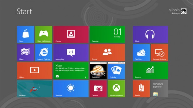
Somewhat surprisingly, Windows 8 also integrates with Facebook, LinkedIn, Twitter, and even Google. Give it your online usernames and passwords and the People tile on the Start screen will come alive with photos taken from friends’ Google+ and Facebook profiles. Touch the tile and each person’s address-book entry will be augmented with his or her tweets and Facebook posts. Microsoft’s mail application can grab a feed from your Gmail in-box. Underneath the user interface, Windows has introduced many important security improvements as well. Windows 8 supports a new feature called Secure Boot, which verifies each time the OS starts up that it hasn’t been tampered with or otherwise modified. A free copy of Microsoft’s antivirus software is enabled by default. Updates download every day, with no subscription necessary. Even encryption is beefed up: for example, the built-in mail client won’t send your password over the Internet unless the link is encrypted and the server has a valid SSL certificate. Windows 8 also enforces stronger security policies on developers, requiring that all approved applications run in a restricted environment called the AppContainer—a kind of sandbox that limits the damage a rogue (or exploited) application can do.
Four Windows and Many Apps
Microsoft plans to sell this core Windows 8 operating system in many different variations. For desktops and laptops there are Windows 8 and Windows 8 Pro (the standard version disables full-disk encryption and remote access features). Although upgrading a computer from 7 to 8 is painless, largely automatic, and cheap (in January the downloadable upgrade cost just $39.99), most users will want to get new hardware to take advantage of touch-based input. Consumers can expect to see a surge in “convertible” laptops that double as tablets, as well as LCD screens with touch-panel overlays.
Microsoft’s new Surface tablet runs Windows RT (RT stands for runtime), which has fewer features than the desktop OS, although visually it’s hard to distinguish between the two. The big difference is inside: the Surface is built upon the low-power ARM microprocessor, the same processor as in most Android tablets and phones (and similar to what Apple has in the iPhone and iPad). Because the ARM’s instruction set is different from that of traditional x86-based systems, RT runs only a tiny subset of today’s Windows applications. Easing that sting, RT comes with a version of Microsoft Office that includes Word, Excel, and PowerPoint. RT’s Office lacks key features used by some corporate customers, such as the ability to execute embedded programs called macros and a copy of Outlook that connects to Exchange servers. It’s probably not a big deal: macros have security problems that IT managers deplore, and RT comes with other apps for e-mail, address book, and calendar functions. New applications written for Windows RT will run on both x86 and ARM-based computers without modification, thanks to Microsoft’s Common Language Runtime (CLR), which uses the same sort of “write once, run anywhere” approach to hardware independence that characterizes the Java programming language.
Phones such as the Nokia Lumia 920 run Windows Phone 8. These phones are also built on an ARM processor and, like the other versions of Windows 8, have a heavy emphasis on touch. Developers may thus create a single code base in order to develop apps that will run on Windows Phone 8, Windows RT, and Windows 8 desktop systems, much the way Apple developers can write a single app for an iPhone and iPad. As with the Apple systems, different screen sizes mean the app will need to display a slightly different user interface on each platform, but the app’s internal logic (which is typically the most expensive part to develop) will largely remain the same.
Apps are the future of Windows. That’s a positive trend for usability and security, but it will also reduce the freedom of mobile-device users. Although Windows 8 desktops allow users to install apps from any location, the phone and tablet versions will only accept apps from the Windows Store. Likewise, Windows RT will run Adobe Flash only on websites that have been preapproved by Microsoft. While the Windows Store doesn’t have nearly as many apps as either Apple’s App Store or Google Play, important ones like Netflix and the New York Times are present. I suspect that most Microsoft users will happily accept Microsoft’s newfound domination of its own platform … that is, provided they can come to terms with the completely revamped Windows interface.
About That Modern Interface
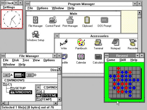
Back in the 1990s, the big advantage of Windows was something we now take for granted: multitasking. Windows could run multiple programs at the same time, each in its own overlapping window. Windows 8 still runs multiple programs at once, but the windows no longer overlap. Instead, the system confronts the user with a Start screen: a multichromatic strip of tiles, each representing an installed application. Some tiles are flat, static, and monochromatic, while others burst forth with color and even animated video. Click a tile, and that application fills the screen. Users switch applications by going back to the Start screen and clicking on another tile, or by cycling with the application “switcher.” It is possible to split the screen between two apps, but that’s it.
The advantage of this new interface is that it focuses the user’s attention solely on the task at hand: a boon, maybe, for people with attention deficit disorder. The problem is that there is simply no way to see three different apps—or even three Web pages—at the same time. The waste of screen real estate becomes increasingly evident as the screen gets larger. The result is that many tasks become unnecessarily difficult. The famed usability expert Jakob Nielsen has joked: “The product’s very name has become a misnomer … the product ought to be renamed ‘Microsoft Window.’ ”
Microsoft’s newfound commitment to simplifying the user experience goes far beyond the cult of monowindowism. The Modern interface is largely devoid of status information. My 11-year-old twins were decidedly annoyed that they couldn’t make the clock appear on the Surface tablet we reviewed. (To do so, you must go to the Start screen and swipe your finger from the screen’s right side.) Windows Phone, meanwhile, was befuddling to a Verizon sales rep I met, who couldn’t figure out how to make the phone display the signal strength indicator. (Make it appear by swiping your finger down from the top of the screen to the middle—but this gesture doesn’t work if you are using the Web browser.)
The interface’s second big departure is something Microsoft calls “charms”—hidden menus that appear with a finger-swipe toward the right side of the screen and contain a mix of controls for the current application and controls for the computer as a whole. Search is implemented this way (swipe right to left and click the magnifying glass), as is the on/off/sleep control (swipe right, click the gear, then click the IEC power symbol). In his damning review of the Modern UI, Nielsen concluded that charms add to the user’s cognitive burden because they hide important information under multiple layers of interaction.
Certainly, the Modern interface is beautiful. The typography is light, airy, and very distinctive. The tiles on the Start screen and many of the application buttons give the appearance of being pressed down at an angle when they are touched, almost as if they were hinged pieces of plastic suspended from the screen. Sadly, in many places the new design also decreases usability, since the only way to tell if a piece of flat text is a control is by clicking on it. For example, touch the Settings charm on the Start screen and six icons appear for changing settings. Underneath the icons is a label, “Change PC settings.” But the text is actually a seventh button that gives access to more PC settings. Previous versions of Windows—and practically every other operating system being distributed today—use 3-D shading to show what’s a clickable control.
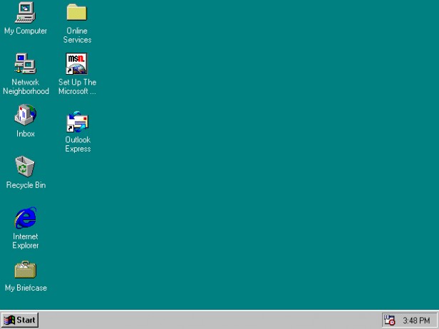
The commitment to touch on laptops and desktops inevitably means that Modern applications show less information on the screen than their Windows 7 counterparts. Microsoft claims that touch is a more natural way of interacting with a computer, but let’s be clear: there is nothing natural about interacting with a computer. A finger is a much worse pointing device than a mouse or an on-screen pointer, for the simple reason that fingers obscure what is on the screen, while a mouse doesn’t. The low information density is unfortunately inherent in a touch-based, on-the-go device like a phone, but it’s an unnecessary inconvenience for knowledge workers sitting at desktop computers with large screens. The Windows desktop remains part of Windows 8 and Windows RT (reachable either through a tile on your Start screen or by using Windows key + D), but without the traditional Start button, users are continually jumping between the two interfaces. Fortunately there are now third-party apps that bring back the Start button.
Get the Phone; Wait on the Desktop
Microsoft’s Modern interface delivers a user experience more personalized and enthralling than what either Apple or Google offers. But it’s also like a puzzle that you can’t quite solve. With controls no longer in a consistent location, I found myself touching text, lines, dots, edges—everything, really—all the time, wondering if something useful would happen. And aspects of this system seem strangely archaic—like the little floppy disk icon to save files, and the little cassette tape icon used to access your voice mail. I doubt that anyone under 25 has ever seen the objects these icons represent.
Microsoft seems determined once again to promote a single user interface for screens of all sizes, but whereas its historical mistake was putting a big-screen interface on a small computer, its new error is putting the small-screen interface on a big one. This may not be a losing strategy: I predict that Windows 8 will be a winner in today’s competitive phone, tablet, and convertible-laptop markets. Apple shows no interest in licensing its operating system; Windows 8 lets phone and tablet manufacturers give their users a choice other than Google Android. Back at the office, Microsoft will continue to sell its desktop applications, and those applications will run on the legacy Windows desktops until IT departments see a version of Windows 8 more appropriate to their needs. That future version will probably add back the Start button and give users a few more status bars and menus. Perhaps Microsoft will even allow applications to run in overlapping windows.
Advertisement
