Intelligent Machines
Windows 8: Does Microsoft’s Split-Personality OS Make Sense?
Microsoft is trying to leverage its Windows customer base to drive demand for the phones and tablets that are its future.


They killed the Start button. That’s how serious Microsoft is about separating Windows 8 from its predecessors.
For 17 years, ever since the company paid the Rolling Stones to use “Start Me Up” in its TV ads, the Start button has been the reliable go-to click for an entire generation of Windows users. But in Windows 8, which launches Friday, it doesn’t exist, not even as some sort of Classic Mode option. The message is clear: This isn’t Windows as you knew it.
Why the big switch?
The answer is that Microsoft is trying to leverage its Windows customer base to drive demand for the phones and tablets that are the company’s future.
The market for desktop and laptop computers is shrinking rapidly—it’s down over 8 percent since last year, according to research firm IDC. A recent Consumer Electronics Association survey found that consumers today would prefer to buy a tablet rather than a desktop or laptop. A new PC is fifth on the list of coveted gadgets, behind TVs, lower-priced mobile phones, and upper-end smartphones.
Microsoft would love to crash Apple and Google’s mobile-gadget party, but the company can hardly give up on its less cool business-focused business. So it’s hoping it can play the Windows legacy to an advantage.
As a result, Windows 8 has two separate ways of working. There’s a familiar Desktop mode, which resembles the multi-window, taskbar-at-the-bottom world most users have becomes used to. But it also has a completely new interface somewhat awkwardly called “Modern-style UI” (previously “Metro”).
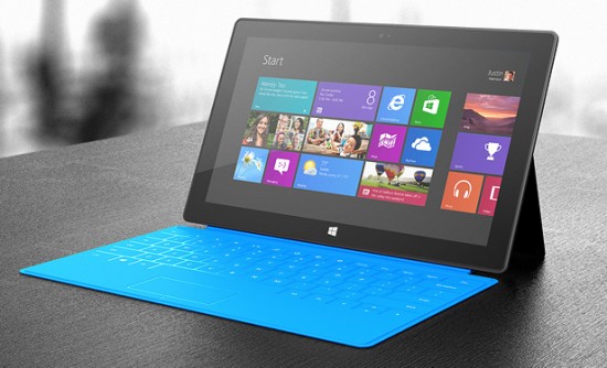
Instead of the Start button, the familiar taskbar, and cascading menus, Windows 8 presents the user with a full-screen grid of large, colorful tiles whose contents change dynamically to show, for example, new Facebook photo posts. On a touch-screen tablet, it seems natural. (Windows RT, the tablet version of the OS, designed for low-power chips, has no Desktop mode). On a desktop or laptop with a keyboard and pointer, you can tap—er, click your way to Desktop mode, but you’ll always start from the screen full of tiles when you boot the machine, and you have to go back to it every time you want to open a new application.
Why not just make two operating systems—one for tablets and another for old-school desktops and laptops? The approach seems designed to make Microsoft’s mobile interface appear more familiar to potential buyers than Apple or Google’s and to help introduce desktop users to the company’s particular vision of mobile computing.
It’s not surprising, then, that the Modern-style UI resembles the panoramic screen of a Windows Phone more than it does a Windows desktop. You can install touch-screen apps on it—including touch versions of Microsoft Office—but you can only run these apps one at a time, at full-screen size, as on a phone or tablet. If you tap the tile for Desktop mode, you’ll get the old-school layout, but it won’t show you any of your Metro apps. Two different worlds.
There’s still a Control Panel, but configuration options have been split between it and the Settings option on the Modern-style UI screen. On the latter, the Start menu and taskbar have been replaced by a hidden set of buttons, called Charms, that slides in when you point to the corner of the screen.
Confused? You probably will be.
In studies conducted by the Nielsen Norman Group, a software consultancy, experienced Windows users had trouble finding applications on the Desktop interface.
Raluca Budiu, the user experience specialist who ran the studies, says: “Some participants were confused by the two versions of Internet Explorer (Metro and Desktop) that looked different and had different histories. They had to remember which IE they had used for a given task. They also were confused by the Control Panel (in Desktop) versus Settings in the Metro interface—for instance, they expected the control panel to change the background of the start screen and they were confused when it only changed the background in the Desktop app.”
Don Norman, a founder of Nielsen Norman and a former Apple vice president, highlighted the difficulty of serving both small and large screens at once.
“The requirements of small-screen mobile devices are incompatible with those of large-screen fixed devices,” Norman says. “Windows 8 has a problem. The real business workhorses of Microsoft Office are not well supported by the mobile apps. So Microsoft had to provide a backwards-compatibility mode, which provides the necessary power, but makes things even more confusing.”
Microsoft has chosen to live with potential complaints partly because it wants Windows-powered tablets to seem more familiar than an iPad to potential buyers.
If Microsoft’s tablets and other mobile Windows devices are successful, there’s another possibility: As people become more familiar with the new interface, Windows computers will seem less alien when they sit down to work.
Could the tablet-style interface ever replace the desktop one? TechRadar deputy editor Dan Grabham, whose site has compiled extensive lists of what’s different from Windows 7 and what you’ll need to relearn, says that’s already happening to the TechRadar staff—they’re using the “tablet” interface instead of Desktop even on desktop computers. “Indeed,” he says, “we’ve noticed ourselves using it more as new apps have been launched and we’ve gotten used to it.”
Microsoft may be hoping that, over time, others will feel the same way. In the meantime, let me tell you a couple of important things you need to know about Windows 8. Press “Alt+Tab” to see all your running apps, both Desktop and Modern-style UI. And to find many functions formerly behind the Start button, press “Win+X” for a popup menu. It’s not the same. But it’s what we’ve got to work with. The Start button is no more.